The Picture of Dorian Gray Book Cover
Print Design | 2024
Software: Adobe Photoshop, Adobe Illustrator, Adobe Indesign.
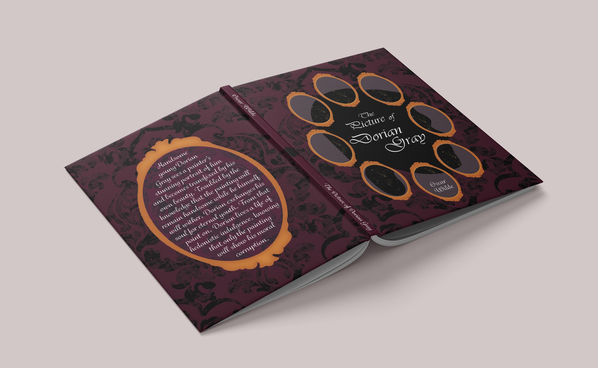
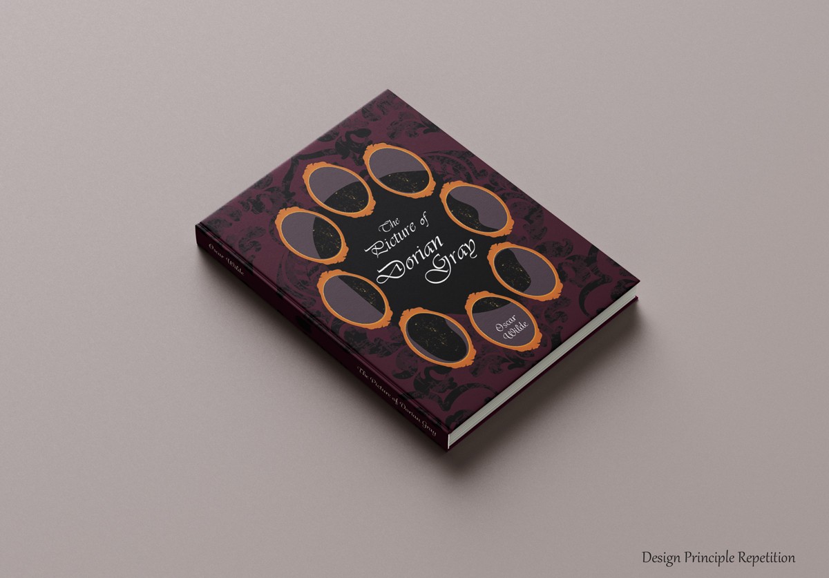
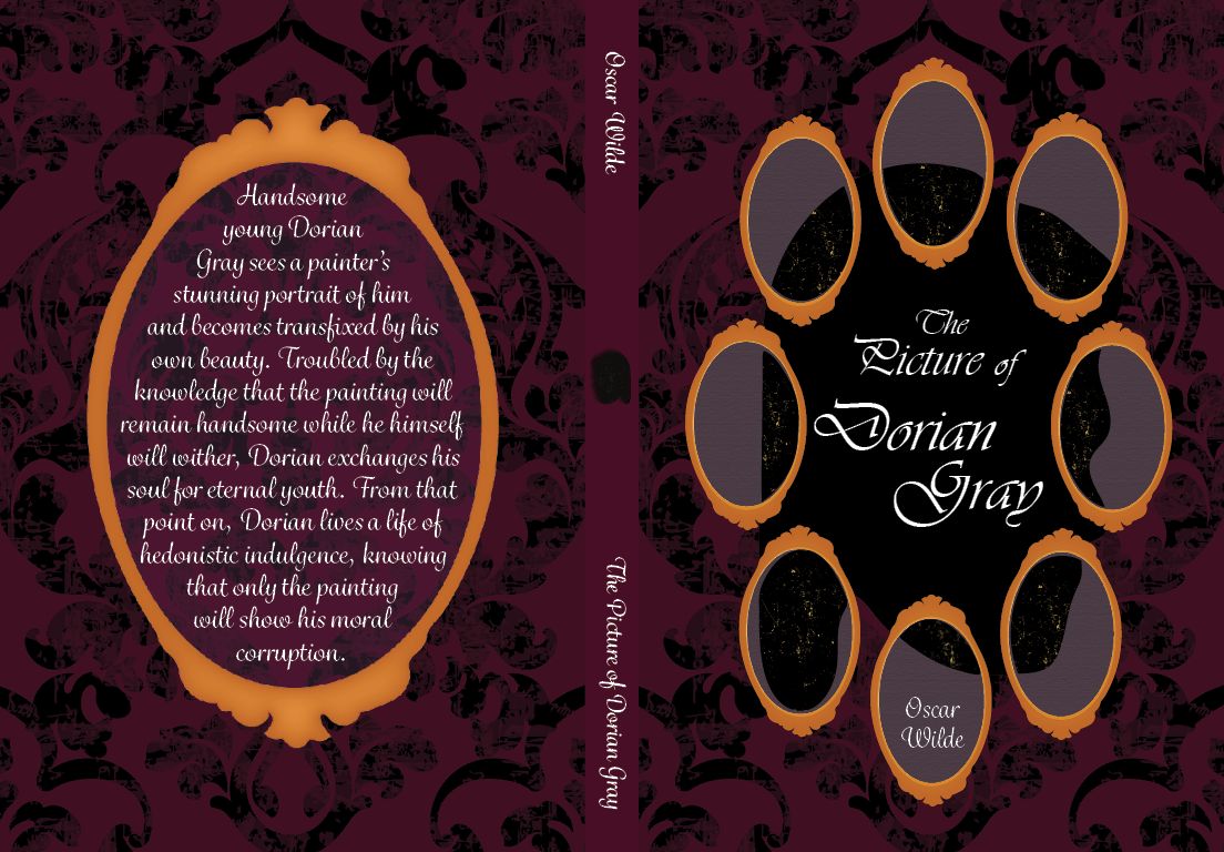
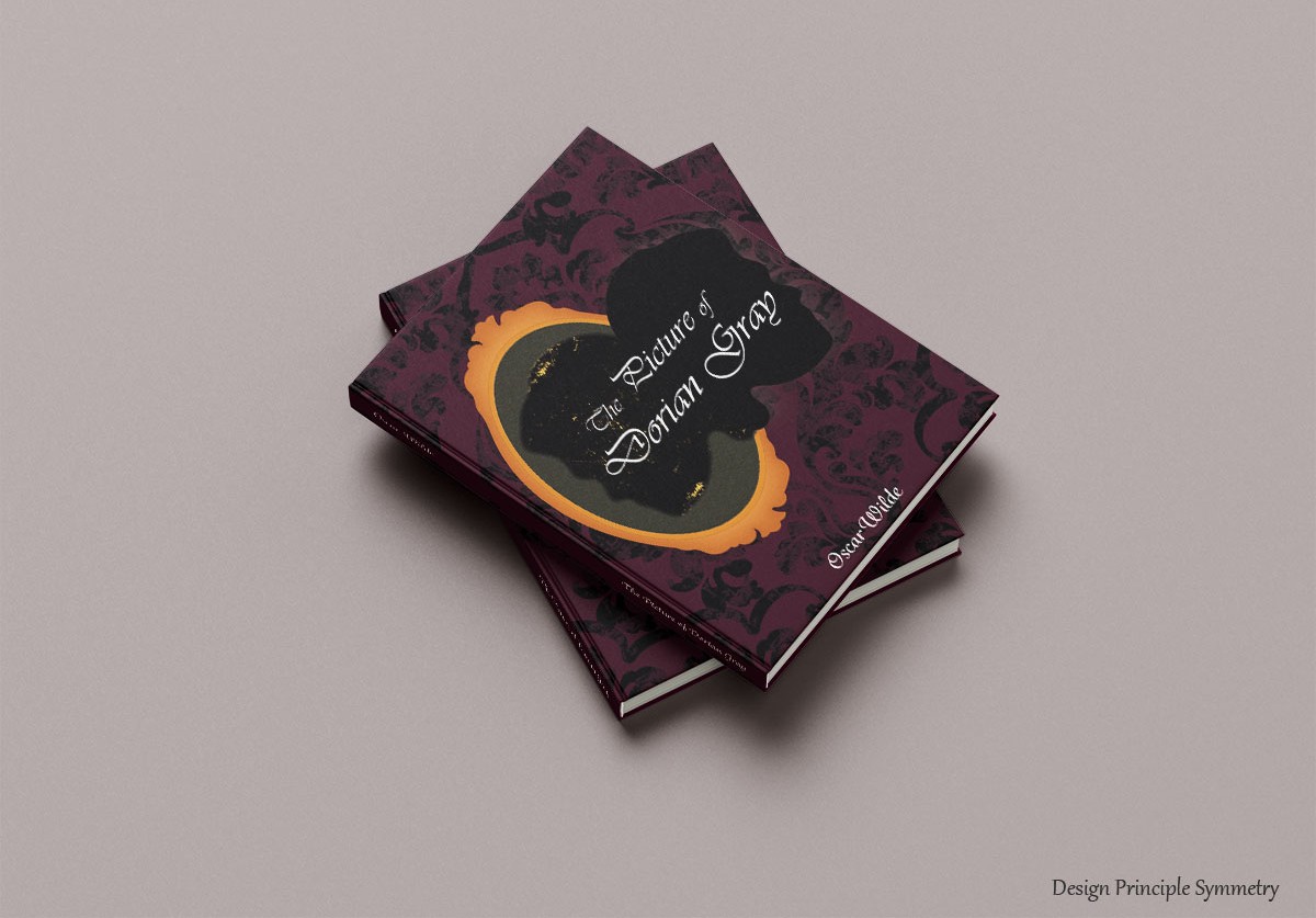
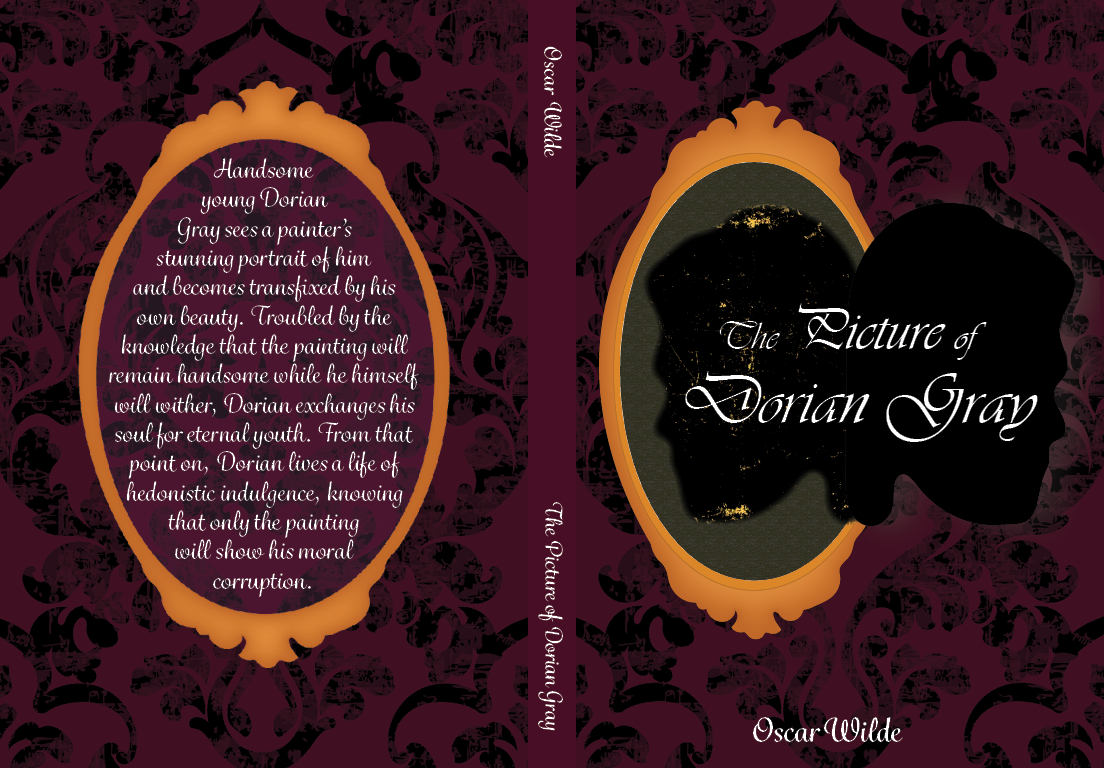
As part of my Visual Communication coursework, I designed two book covers for 'The Picture of Dorian Gray.' The assignment required me to demonstrate my understanding of design principles by using repetition in one cover and symmetry in the other.Researching existing covers for 'The Picture of Dorian Gray' I noticed they were too repetitive, which inspired me to pursue a more original approach, but still reflecting the book's plot.
The book was written in the 20th century, so I used a texture background similar to that age. For the color palette, I use dark colors such as burgundy, purple and gold to represent the richness but the sinister of the plot. For the typography, I used the font “Hey Beauty” to match the elegance of the main character, Dorian Gray.